Ginsu
PROJECT OVERVIEW
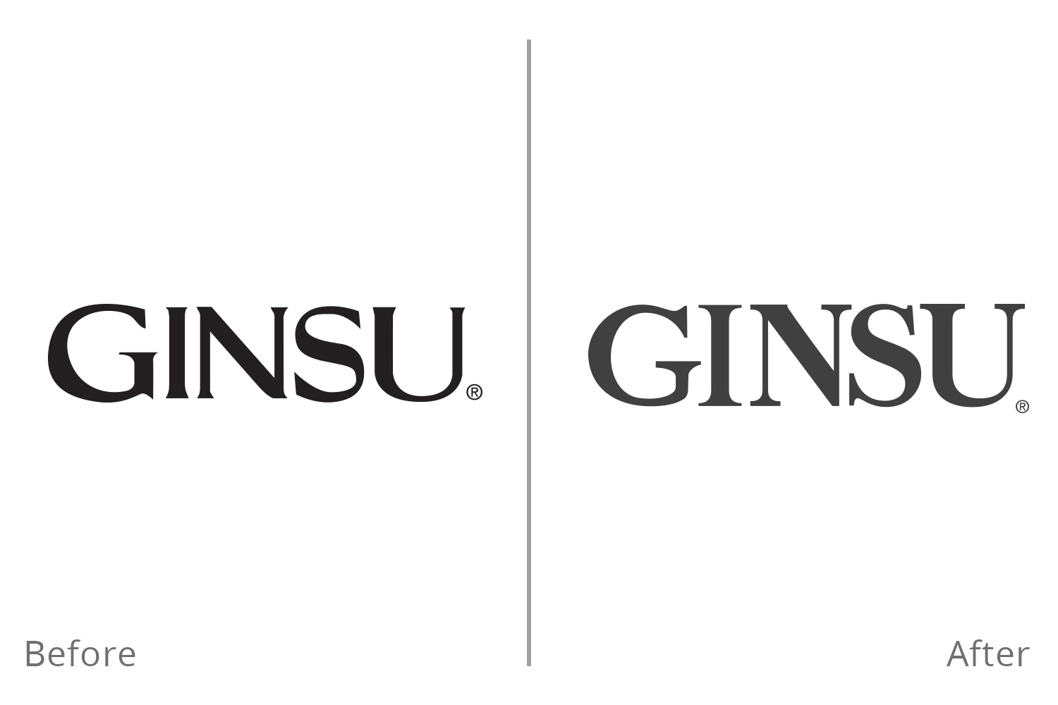
The corporate rebrand of the famous 1980's infomercial Ginsu knives. Bringing the brand into the 21st century by asserting the strength of the Ginsu products into the brand message through the new brand icon and typography logo.
PROJECT ROLE
Worked as a single designer in-house team to concept and create the new Ginsu Logo.
PROCESS
Studying the brand and its history the company knew they wanted to pull away from the Asian past of the brand. Focusing primarily on cleaning up and modernizing the old typeface to give the logo a simple refresh. Then researching other brands, we decided to create an icon to accompany the word mark. The shield G provides the brand with an edge and security of the strength of Ginsu knives. The new logo brings the Ginsu into the 21st century with a nod to the old.